Why fancy text can be inaccessible
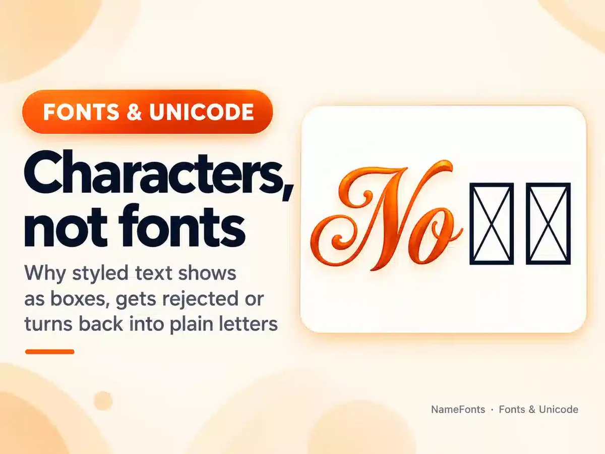
Fancy text generators swap ordinary letters for look-alike Unicode characters (see why fancy fonts don’t work everywhere) — mostly from the Mathematical Alphanumeric Symbols block, which Unicode intends for mathematical notation, not ordinary text. People who see the screen read “𝓝𝓸𝓿𝓪” as “Nova”. Assistive technology reads the characters as what they really are.
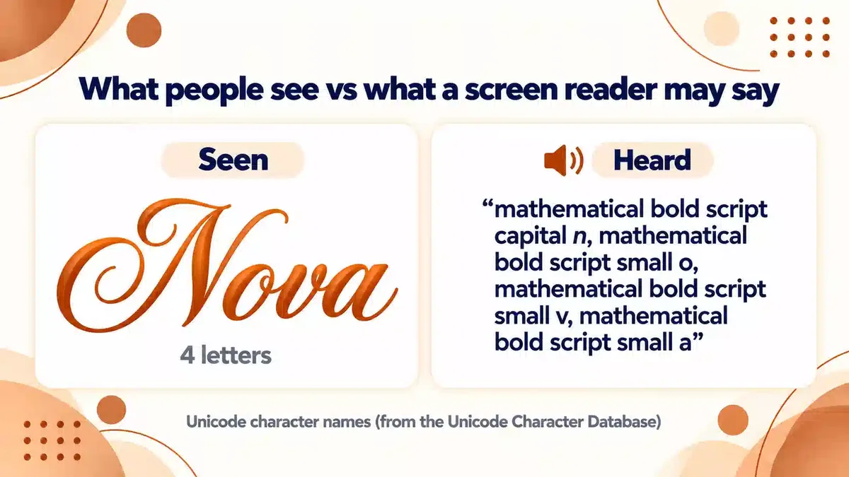
Each of those four letters has its own official name: mathematical bold script capital n, mathematical bold script small o, mathematical bold script small v, mathematical bold script small a. The UK disability charity Scope reports that screen readers may announce styled letters this way, read something unrelated, or skip them entirely. Either way, a short name becomes slow, confusing or invisible for people who rely on a screen reader.
Who is affected
- Screen reader users — people who are blind or have low vision, and some people with reading difficulties.
- People using translation or text-to-speech tools, which may not recognise styled letters as words.
- Anyone searching — search boxes often do not match styled letters with plain ones.
- People with cognitive or reading difficulties, for whom decorative letterforms and heavy symbols are harder to read.
Seven habits for accessible styled text
- Keep the important words plain. Style a short name or one word, not whole sentences, bios or instructions.
- Put the plain version where people look. Many apps have both a display name and a handle or bio — keep one of them in plain letters.
- Use decorations at the edges. Symbols around a name are easier to skip than symbols between letters.
- Use fewer symbols. Each symbol may be read aloud by name; five stars can become five announcements.
- Do not use styled text for key information. Dates, links, prices, rules and calls to action should always be plain.
- Prefer emoji with clear meanings over decorative symbols when you want a pictograph — emoji have standard descriptions, but keep them few and at the end.
- Test it. Turn on your phone’s screen reader (VoiceOver on iPhone, TalkBack on Android) and listen to your name or bio.
Better and worse examples
| Less accessible | More accessible | Why |
|---|---|---|
| 𝓙𝓸𝓲𝓷 𝓶𝔂 𝓽𝓮𝓪𝓶 𝓽𝓸𝓭𝓪𝔂 | Join my team today ✦ | A sentence in styled letters may be read letter by letter; plain text plus one accent keeps the look. |
| ★彡N★o★v★a彡★ | ★ 𝓝𝓸𝓿𝓪 ★ | Symbols between letters break the word; edges are easier to skip. |
| 𝓝𝓸𝓿𝓪 (only) | 𝓝𝓸𝓿𝓪 · bio: “Nova” | The plain spelling lets people search for and hear your name. |
A quick checklist before you post
| Question | If the answer is no |
|---|---|
| Can someone find me by typing my name in plain letters? | Add the plain spelling to your handle, display name or bio. |
| Is every important word plain text? | Rewrite dates, links, prices and instructions in plain letters. |
| Are decorations only at the start or end? | Move symbols out from between letters. |
| Would the text still make sense with every symbol removed? | Replace symbols that carry meaning with words. |
| Have I listened to it with a screen reader? | Turn on VoiceOver or TalkBack for one minute and listen. |
For creators and businesses
If you post for an audience, the same rules apply with higher stakes. Use real formatting (the app’s own bold or italic, where it exists) instead of styled Unicode characters, write hashtags in plain letters — capitalising each word (#PlayNova) helps screen readers say them correctly — and keep styled text for small decorative touches.
Frequently Asked Questions
Do screen readers read fancy text?
Often not as words. Screen readers may announce styled letters by their Unicode names, such as “mathematical bold script capital N”, read something unrelated, or skip them.
Is there a fully accessible fancy font?
Not as copy-and-paste text. Real fonts change how ordinary letters look without changing the characters, but most apps do not let you choose a font. Keeping a plain version alongside a styled one is the practical solution.
Sources
- Scope for Business: Accessibility, screen readers, special characters and Unicode symbols — screen reader behaviour with styled characters
- Unicode Technical Report #25: Unicode Support for Mathematics — mathematical alphanumerics are intended for mathematical or technical notation
- Unicode Character Database — character names (verified with Python unicodedata)
Check what your styled text is really made of before you post it.