Side by side
The table shows one name, “Ember Knight”, in each style. All of them are Unicode characters, not fonts — so they can be pasted into apps that have no font menu. The last column shows the length in UTF-16 units; the plain name is 12.
| Result | Style | Unicode letters used | UTF-16 units |
|---|---|---|---|
| ℰ𝓂𝒷ℯ𝓇 𝒦𝓃𝒾ℊ𝒽𝓉 | Cursive | Mathematical Script | 20 |
| 𝓔𝓶𝓫𝓮𝓻 𝓚𝓷𝓲𝓰𝓱𝓽 | Bold cursive | Mathematical Bold Script | 23 |
| 𝔈𝔪𝔟𝔢𝔯 𝔎𝔫𝔦𝔤𝔥𝔱 | Gothic | Mathematical Fraktur | 23 |
| 𝕰𝖒𝖇𝖊𝖗 𝕶𝖓𝖎𝖌𝖍𝖙 | Bold gothic | Mathematical Bold Fraktur | 23 |
| 𝐄𝐦𝐛𝐞𝐫 𝐊𝐧𝐢𝐠𝐡𝐭 | Bold serif | Mathematical Bold | 23 |
| 𝗘𝗺𝗯𝗲𝗿 𝗞𝗻𝗶𝗴𝗵𝘁 | Bold sans | Mathematical Sans-Serif Bold | 23 |
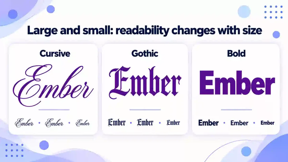
Cursive (script)
Looks: flowing, elegant, personal. Best for: profile names, bios, soft or romantic themes, short names. Watch out: thin strokes and similar capital shapes make longer names hard to read at small sizes.
A quirk worth knowing: eleven regular script letters (ℬ ℰ ℱ ℋ ℐ ℒ ℳ ℛ ℯ ℊ ℴ) come from the older Letterlike Symbols block rather than the mathematical block, because they were encoded first. They can look slightly different from their neighbours in some fonts. The bold cursive set has no such gaps.
Gothic (fraktur / blackletter)
Looks: medieval, dramatic, dark. Best for: dark or fantasy gaming names, clan names, short single words. Watch out: many fraktur capitals are hard to recognise for readers who do not know blackletter — “ℑ” and “𝔗” are easy to confuse.
Five regular fraktur capitals (ℭ ℌ ℑ ℜ ℨ) also come from Letterlike Symbols. Bold gothic is usually clearer on screens than regular gothic.
Bold (serif and sans)
Looks: strong, clean, confident. Best for: competitive gaming names, team tags, headings in bios, anything that must be read quickly. Watch out: it can look like you are “shouting” if a whole bio is bold. Bold sans is the most readable styled option in small scoreboards.
How to choose
| If you want… | Choose |
|---|---|
| Maximum readability in fast games | Bold sans |
| A soft, personal or cute look | Cursive or bold cursive |
| A dark, epic or fantasy feel | Bold gothic |
| Something formal or classic | Bold serif |
| A long name or a full sentence | Plain text, with one styled word at most |
Mixing styles in one name
It is tempting to combine styles — a gothic first letter, a cursive middle and a bold tag. Used carefully, one contrast can work: a bold clan tag in front of a plain or cursive name, for example. More than two styles in one name usually looks accidental and is much harder to read. A few rules of thumb:
- One style per word. Switching style inside a word breaks it into pieces for the reader.
- Contrast by weight, not by family. Bold sans plus regular plain text reads better than gothic plus cursive.
- Keep frames simple when the letters are decorative. Gothic or cursive letters already carry a lot of detail; add a light bracket or nothing.
- Check the result small. Look at it at the size of a scoreboard or comment, not only in a large preview.
What all three have in common
- Length: almost every styled letter is 2 UTF-16 units and 4 UTF-8 bytes; check with the Name Character Counter.
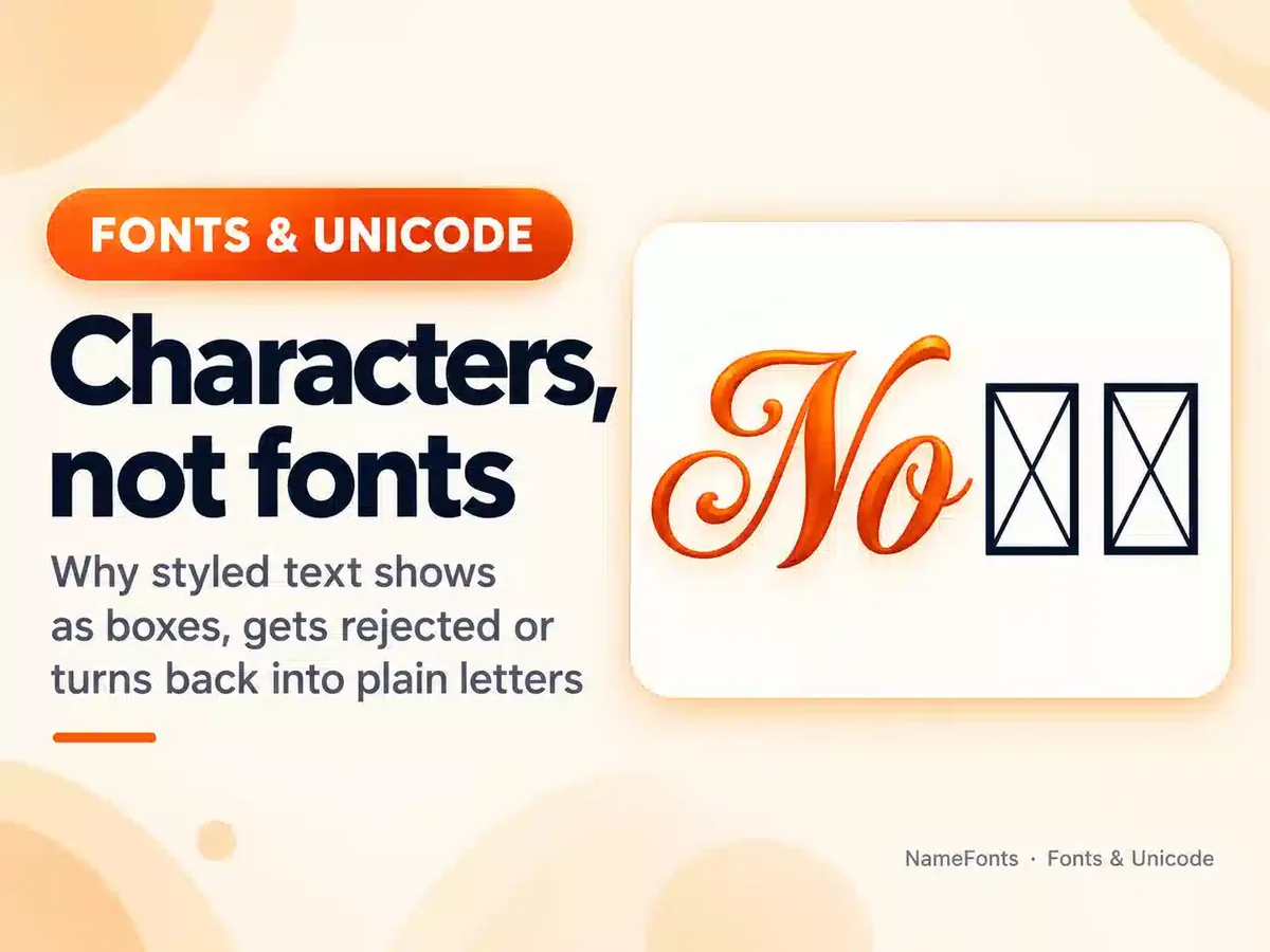
- Compatibility: current phones display them, but some games, older devices and filtered fields do not. Test before you commit.
- Normalization: some apps turn styled letters back into plain ones — see why fancy fonts don’t work everywhere.
- Search: people typing the plain name will not find the styled one unless the app normalizes text.
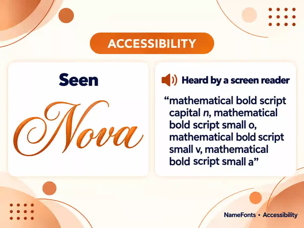
- Accessibility: screen readers may announce each letter by its Unicode name (for example “mathematical bold capital E”) or skip it. Keep a plain version where people need to read or find you — our accessible fancy text guide shows how.
Frequently Asked Questions
Which style is easiest to read?
Bold, especially bold sans. Cursive and gothic are decorative and become harder to read at small sizes and in long names.
Why do some cursive letters look different from the rest?
Eleven regular script letters come from the older Letterlike Symbols block instead of the mathematical block, so some fonts draw them in a slightly different design.
Sources
- Unicode code chart: Mathematical Alphanumeric Symbols (U+1D400–U+1D7FF) — script, fraktur and bold letters
- Unicode code chart: Letterlike Symbols (U+2100–U+214F) — the older script and fraktur letters
- Unicode Technical Report #25: Unicode Support for Mathematics — why these letters exist
- Scope for Business: screen readers and Unicode symbols
Try your own name in each style and compare them side by side.